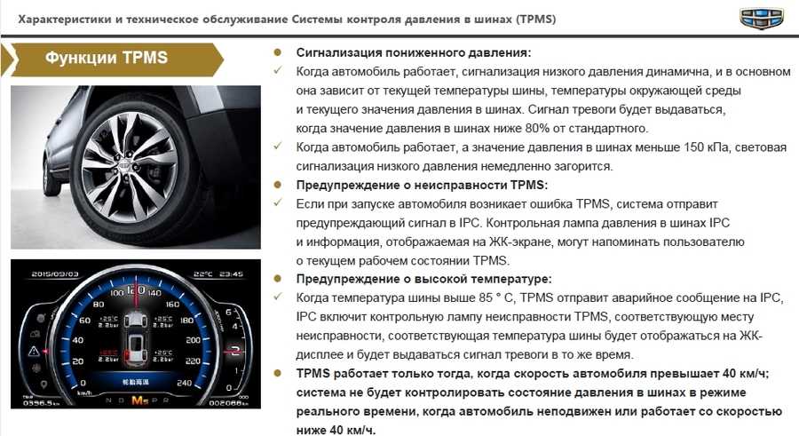
El lector de código de barras es uno de los dispositivos esenciales para el registro, control y venta de productos en los negocios. En este contenido te explicamos qué es, su funcionalidad, los beneficios de tenerlo y te presentamos algunos de los recomendados.
El código de barras es una representación del conjunto de líneas paralelas de diferentes grosores y números. Estos en conjunto transmiten caracteres e información importante de los productos etiquetados, tales como el número de lote, fecha de envasado, nombre, precio, entre otros.
Con los códigos de barras se transmite la información a la maquina o software, con la finalidad de reconocer y hacer inventario de cada producto, con información única, clara y global, en diferentes puntos de la cadena logística.
El lector de código de barras es el dispositivo electrónico con el que se escanean los códigos de barras para descifrar la información de los productos, facturas, descuentos y cupones en caja.
Los lectores pueden tener diferentes tecnologías y funciones. Generalmente, el lector de código de barras funciona con láser, el cual es el que descifra y muestra el número o información que reúnen los códigos.
La información descifrada es enviada al computador o terminal, por medio de la señal de internet (vía WiFi o por cable), de modo legible para el operador.
Asimismo, los lectores de código de barras son de diferentes tipos según su modo de conexión. Los más comunes son los de puerto USB, Bluetooth, WiFi y puertos serie o serial (los de tecnología más antigua).
En cuanto a diseños también existen diferentes opciones, tales como las de mesa y los de mango con soporte.
|
En SAT Store encuentras las mejores marcas, diseños y tecnología de lectores de códigos de barra. |
La principal funcionalidad de los lectores de códigos de barra es la de los procesos de pago y registro de productos en caja, muy útil en comercios de abarrotes, tiendas, entidades bancarias, puntos de pago de facturas, entre otras.
Estos pueden estar diseñados para la lectura de diferentes tipos de códigos, recordando que estos han presentado evoluciones por la tecnología con la que se diseñan. Actualmente, existen lectores con capacidades para leer códigos antiguos como los 1D y de los más vigentes como los 2D y QR.
Los lectores de esta generación también se diseñan para decodificar sobre celulares, PC y PDA, lo cual entrega una funcionalidad completa a la hora de atender en caja y de llevar el control de inventarios.
Toda esta funcionalidad con las ventajas de diseños omnidireccionales de alto alcance, que tienen un mayor espectro y permiten que desde la primera pasada se descifren los códigos efectivamente. Del mismo modo, existen unos modelos potentes capaces de descifrar códigos borrosos o de mala calidad.
Desde su creación los lectores de códigos de barras han presentado diferentes beneficios en diferentes frentes de los negocios. Estos son algunos de ellos:

La experiencia en tienda sigue siendo una de las grandes preocupaciones para los negocios que saben la importancia de una atención rápida. Los consumidores demandan velocidad a la hora de adquirir sus productos y no están dispuestos a realizar grandes filas para lograrlo.
Por tanto, una de las principales razones por las que deberías tener el lector de código de barra en tienda es por el cliente, siendo este el centro de todas las estrategias de las empresas exitosas.
La siguiente gran razón, es la productividad del personal en punto y la reducción de errores en la gestión de inventario y el proceso de cobro.
Como ves, tener un lector de código de barra es una inversión que ayuda a cumplir los objetivos de la empresa y las expectativas de los clientes.
Ahora, la gran pregunta es qué tipo de lector de código de barras usar en la tienda o negocio. Para facilitarte la tarea, te presentamos unos diseños variados y de la mejor calidad:
Modelos como el Lector de código de barras Datalogic Gryphon Gps4421-Bkk1B
corresponden a los de mesa.![]() Este, por ejemplo, es indicado para la lectura de códigos D2 y QR. Es ideal para puntos de atención en entidades bancarias o afines, pues tiene la funcionalidad especial para la lectura de cédulas.
Este, por ejemplo, es indicado para la lectura de códigos D2 y QR. Es ideal para puntos de atención en entidades bancarias o afines, pues tiene la funcionalidad especial para la lectura de cédulas.
Su tecnología es omnidireccional y permite descifrar códigos de celulares, PDA y PC, incluso, si son de baja calidad. Su conexión es por USB y tiene un alcance de 42 cm.
Estos pueden ser inalámbricos o con conexión por cable. Algunos de los recomendados son:
Corresponde a los de tipo inalámbrico ya que puede conectarse por bluetooth. También, da la opción de conexión por USB. Su tecnología permite una lectura rápida de códigos tipo 1D y 2D. Para su función inalámbrica incluye batería de litio y la base de reposo y carga.
Este modelo es para conexión por cable, mediante puerto USB y serial. Cuenta con tecnología omnidireccional de rápida lectura y un diseño ergonómico de gatillo. Permite escanear códigos 1D, 2D y cédulas. Esto lo convierte en uno versátil para el uso en tiendas, oficinas de recaudo, entidades bancarias y más.
Son especiales para mayor agilidad en la lectura de códigos, muy utilizados en supermercados de grandes superficies. De estos existe el Lector de código de barras Datalogic Magellan 9300, destacado por su tecnología para descifrar códigos 1D y 2D.
Este tiene un panel amplio para pasar productos a gran velocidad y también permite escanear códigos de cupones impresos o de teléfonos inteligentes. Su conexión se puede realizar por USB y puerto RS232.
Por último, no olvides revisar las necesidades de tu negocio, su actividad, el tipo de códigos a descifrar, el espacio disponible para ubicar los lectores y otros aspectos importantes para la elección. De esto depende encontrar el mejor.
¡En SAT Store encuentras todos los tipos de lector de código de barras!
El lector de código de barras permite reconocer la información de los productos etiquetados en punto de atención o venta. Esta tecnología ha evolucionado a medida que evolucionan los tipos de código, dentro de los cuales los de tipo 1D, 2D y QR son los más frecuentes.
Este sistema y dispositivos de lectura de códigos de barra tienen múltiples funcionalidades en la gestión de inventarios, pagos y atención a clientes. Sus beneficios son percibidos para las empresas que los usan, los clientes y los operadores.
Los lectores de barras pueden ser de diferentes tipos según su modo de conexión (inalámbricos o por cable) y diseño (de gatillo, mango o mesa).
Para elegir los mejores es indispensable revisar las necesidades del negocio y elegir un proveedor con trayectoria y calidad reconocida, tal como lo es SAT Store.
Te puede interesar:
¿POR QUÉ IMPLEMENTAR CONTROLES DE ACCESO EN TU NEGOCIO?
CONTROL DE ACCESO Y ASISTENCIA A TRAVÉS DE BIOMETRÍA
BÁSICOS PARA MONTAR TU NEGOCIO
It looks like nothing was found at this location. Maybe try one of the links below or a search?
Try looking in the monthly archives. 🙂
ArchivesSelect Month March 2023 February 2023 January 2023 December 2022 November 2022 October 2022 September 2022 August 2022 July 2022 June 2022 May 2022 April 2022 March 2022 February 2022 January 2022 December 2021 November 2021 October 2021 September 2021 August 2021 July 2021 June 2021 May 2021 April 2021 March 2021 February 2021 January 2021 December 2020 November 2020 October 2020 September 2020 August 2020 July 2020 June 2020 May 2020 April 2020 March 2020 February 2020 January 2020 December 2019 November 2019 October 2019 September 2019 August 2019 July 2019 June 2019 May 2019 April 2019 March 2019 February 2019 January 2019 December 2018 November 2018 October 2018 September 2018 August 2018 July 2018 June 2018 May 2018 April 2018 March 2018 February 2018 January 2018 December 2017 November 2017 October 2017 September 2017 August 2017 July 2017 June 2017 May 2017 April 2017 March 2017 February 2017 January 2017 December 2016 November 2016 October 2016 September 2016 August 2016 July 2016 June 2016 May 2016 April 2016 March 2016 February 2016 January 2016 December 2015 November 2015 October 2015 September 2015 August 2015 July 2015 June 2015 May 2015 April 2015 March 2015 February 2015 January 2015 December 2014 November 2014 October 2014 September 2014 August 2014 July 2014 June 2014 May 2014 April 2014 March 2014 February 2014 January 2014 December 2013 November 2013 October 2013 September 2013 August 2013 July 2013 June 2013 May 2013 April 2013 March 2013 February 2013 January 2013 December 2012 November 2012 October 2012 September 2012 August 2012 July 2012 June 2012 May 2012 April 2012 March 2012 February 2012 January 2012 December 2011 November 2011 October 2011 September 2011 August 2011 July 2011 June 2011 May 2011 April 2011 March 2011 February 2011 January 2011 December 2010 November 2010 October 2010 September 2010 August 2010 July 2010 June 2010 May 2010 April 2010 March 2010 February 2010 January 2010 December 2009 November 2009 October 2009 September 2009 August 2009 July 2009 June 2009 May 2009 April 2009 March 2009 February 2009 January 2009 December 2008 November 2008 October 2008 September 2008 August 2008 July 2008 June 2008 May 2008 April 2008 March 2008 February 2008 January 2008 December 2007 November 2007 October 2007 September 2007 August 2007 July 2007 June 2007 May 2007 April 2007 March 2007 February 2007 January 2007 December 2006 November 2006 October 2006 September 2006 August 2006 July 2006 June 2006 May 2006 April 2006 March 2006 February 2006 January 2006 December 2005 November 2005 October 2005 September 2005 August 2005 July 2005 June 2005 May 2005 April 2005 March 2005 February 2005 January 2005 December 2004 November 2004 October 2004 September 2004 August 2004 July 2004 June 2004 May 2004 April 2004 March 2004 February 2004 January 2004 December 2003 November 2003 October 2003 September 2003 August 2003 July 2003 June 2003 May 2003 April 2003 March 2003 February 2003 January 2003 December 2002 November 2002 October 2002 September 2002 August 2002 July 2002 June 2002 May 2002 April 2002 March 2002 February 2002 January 2002 December 2001 November 2001 October 2001 September 2001 August 2001 July 2001 June 2001 May 2001 April 2001 March 2001 February 2001 January 2001 December 2000 November 2000 October 2000 September 2000 August 2000 July 2000 June 2000 May 2000 April 2000 March 2000 February 2000 January 2000 December 1999 November 1999 October 1999 September 1999 August 1999 July 1999 June 1999 May 1999 April 1999 January 1981 July 1977 January 1977 December 1976 September 1973 June 1972 February 1971 December 1970 September 1970 August 1970 May 1970 April 1970 March 1970 January 1970
If products differ significantly, they should be presented in the catalog on separate product cards; the parameters of one product should be displayed on the product page.
For the 5th edition of the Ecommerce User Experience Report Series, we've produced another study. It showed that sometimes people have difficulty buying products that have multiple options (i.e., they can be made from different materials, have different prints, come in different sizes and colors).
The usability issues we identified occurred when an e-commerce site presented the same product with multiple options in the catalog as if they were different products. And vice versa - when different products were shown as if they were one product with different characteristics. Let's discuss the difference.
Suppose there are two different products, A and B, on an e-commerce site. If the only difference between them is is one parameter (for example, color, size, print, material), then they are considered one item. However, if the characteristics of two products are significantly different, then these are different products.
The key guiding principle based on the study of online retailers can be summarized as follows:
If products differ, they should be presented in the catalog on separate product cards; characteristics of one product must be placed on the product page.
If this rule is not observed, the following usability problems arise:
In this article, we will use examples to analyze both problems that have arisen in usability testing and explore in detail the obstacles they create.
In our research, we came across product pages with dropdown lists. But instead of choosing the characteristics of one product, they presented completely different products.
For example, on the Best Buy online product page, along with the details of the TV, there was a drop-down list showing other TV models. Each model differed significantly in function and technology.
The Best Buy website prompted users to select their TV model on the product page.While shopping for a new TV, one of the study participants was overwhelmed by the selection of models on display. In fact, when you click on any of the fields in the drop-down list, the information on the product page (including the product name) changes. But the participant did not immediately notice this, because the image remained the same.
The distinction between the goods themselves and their characteristics is extremely important. The wrong choice causes problems for users for two reasons.
First, with a drop-down list of complex features that completely change the product description, users will not have enough information to make an informed choice . Choosing a TV model is a difficult decision, because there are many differences between them - they are completely different products! People do not have a deep understanding of how one collection differs from the rest, so the options in the drop-down list (for example, CX and NanoCell 81) mean nothing to most users. (This confusion is exacerbated by meaningless names, but that's another story.)
Best Buy: Below the TV model selection box is a link "What's the difference?" (eng. “What’s the difference”).Clicking on this link opens a modal window with a comparison and a link to the full comparison table (“See full comparison”). Unfortunately, our study participant did not notice this link.
When choosing an item as expensive as a TV, more information is needed than just the options presented in the drop-down menu. Study participant noted:
“I had to visit third-party websites and the LG website to understand the difference between TV models. For example, to find out how BX differs from CX. I can see different price ranges of TVs, but I need to understand what features are included in the price and which ones are right for me?
(Actually, there was information on the BestBuy website that explained the differences between different series of LG TVs, but the participant in the study did not find it).
Second, Most of the buyers who visited the product page have already searched and filtered products by price and size that match their purchase criteria. So they look at the product page with some information already. Demonstrating alternative products without additional context will be confusing, especially since they do not meet the needs of users. People should carefully evaluate the details of each of the alternatives to determine if they meet their criteria. For example, our customer found himself looking at a model that cost much more than the price he was targeting. At this point, he found it difficult to re-find the TV he was initially interested in.
Possibly the ability to select other TV models has been added to the product page so that customers can find similar models. However, this problem can be solved in other ways. For example, place them on the product page in the Related Products section, as other online TV stores have done. Other models can also be found when browsing the product catalog. Providing a wider selection of models on the product page is not worth the hassle users face.
Costco.com: The product page contained information about one model (pictured above). Other models and sizes are located in the section "Similar products" - "Similar products" (photo below). For these reasons, the feature selection on the product page should only be provided for the same product .
On the other hand, there is the opposite problem, when each feature of one product has its own product page.
Variants of the same product presented as separate cards in a catalog result in usability issues for shoppers.
So it was at Arhaus.com. A study participant wanted to buy a stool from the Arhaus online store. She visited the Robin Wishbone Counter Stool product page but was disappointed. There, the chair was shown to come in a single "Stone Vintage" color that didn't match her interior.
The product page on Arhaus.com gives the impression that the stool is only available in one color and has only one leg height. In fact, this stool was presented in various wooden bases of different heights. Instead of allowing customers to choose the color and height of the base on the product page, the catalog presented several cards of this product with a link to a separate product page. Each product page corresponded to one color and one base height for the same stool. So since the stool came in 3 different colors and 2 heights, 6 different product pages were created to showcase it.
On top of that, there was another design error on the product page: the color of the base (“Stone Vintage”) was not properly represented – it was shown in the description next to Fabric. Moreover, only one color swatch (“Stone Vintage”) was listed next to this name, when in fact there were different colors of the base of the stool, but they were shown on other cards and different product pages.
Arhaus had separate product pages for each color and base height.This catalog shows two variations of the same stool placed together with other completely different stool designs. In this presentation of products, it is difficult for users to understand that these are different versions of the same product.
It is possible that Arhaus created separate cards and product pages for each variation of this stool so that they are presented equally with the rest of the products. Unfortunately, this raises two serious usability problems:
We will discuss each obstacle below.
One would like to think that site visitors carefully browse the entire catalog of products, but this is not always the case. If there is a unique product page for each variation of a single product, the result will be an increase in the number of variations to view. Users who are only interested in one item must now view all options, most of which are of no interest to them. The number of options can easily be overwhelming. Buyers can get distracted or give up before they find what interests them.
Luckily, our customer, who was interested in the Wishbone stool, returned to the catalog where she came across a similar black stool model. She said: “Oh, this is the same stool, only in black! It looks like it. I prefer black, but now I'm wondering what other colors it comes in!"
She later realized that the black stool she had chosen was actually too high. It was called Robin Wishbone Barstool and was taller than the Robin Wishbone Counter Stool which she had originally found under the name Vintage Stone. This discovery added another problem to the search process. She kept searching the catalog for other colors of the stool, but she also had to pay close attention to the name of the stool, which could tell the height of the stool, to make sure she only chose the color she wanted. The fact is that stools of different heights looked the same in the photographs.
Luckily, she found a black Wishbone stool at just the right height by carefully perusing the catalog in the stool category. Although she could have used the search function, that would have interrupted the browsing process she had already wasted time on.
Online shoppers often break the process into two phases: (1) browse stage, where they browse through the options and save the items they like either in a separate tab (favorites) or in the shopping cart , and (2) selection step where they evaluate and compare stored items to make a final selection before placing an order.
We have already discussed the extra work associated with viewing each feature of the same product on different product pages. However, users face new difficulties in the selection process.
At the browsing stage, many customers do not realize that they have chosen the same product, presented in several variants. The identification of duplicates during the browsing phase depends on users' short-term memory, as they must remember that they have seen a similar product before.
Even those who have noticed that the same product is displayed several times in the catalog may not be ready to stop at one product characteristic during the browsing stage. As a result, at the selection stage, they will have more options to make the final decision. This process can become extremely complex and confusing.
A separate product page must be available for each product and all variations. However, in order for users to discover other characteristics of the product, this must be clearly indicated in the catalog. If the parameters are of an aesthetic nature (for example, color and pattern), the corresponding options should be clearly shown in the catalog on the product card, located under the name of the product. Users are accustomed to this approach, and if the options are noticeable, they will know that there are several models available.
In the product card in the catalog of the Arhaus online store, color options were indeed located under the image. Next to them was a link "+MORE" (note from the English. "More colors"), when clicked on, the user could see additional colors of the stool base. However, the study participant who bought the stool missed this detail.
Arhaus.com: The study participant did not notice the “+ MORE” link, which, when clicked, would allow her to see additional colors for the stool base.
“+ MORE” links were skipped by the participant for several reasons:
When the participant viewed the page, she saw only one color option, so she never returned to view that area.
If a product has multiple parameters with different options, as was the case with Arhaus stools (where the height of the stool and the color of the base were different parameters and had several options), their demonstration in the catalog may require more attention.
Size is often one of the variables and in most cases the choice of size should not be presented on the item card in the catalog. This is what happens when you buy clothes. You are supposed to be able to choose the size on the product page and there is no need to indicate that there are different sizes in the catalog.
Most other sites that sell chairs have the ability to select the height of the stool on the product page. They also thought about filtering the stools by height to narrow down the selection.
When a product has several parameters other than size (for example, upholstery color and base color, as in the case of stools), there are several common ways in online stores to indicate the presence of these parameters in the catalog:
For example, white/metal or grey/natural. The combination can be presented as a one-color or two-color sample. Users should be able to click on samples to change product previews and see different options.
Crate and Barrel used a two-tone swatch to represent the black frame and white seat combination for the chair on the right. Alternatively, instead of color swatches, product thumbnails can be used to show possible variations - as IKEA did in the example below.
This approach only works well if the combination of choices results in a manageable number of choices, such as less than 10. If there are more choices, options cannot be combined.
Instead of showing one image of a product with multiple options, choose a photo that shows several of the same product in different variations (for example, products with different seat upholstery colors and grounds).
Grandin Road featured several stools in one photo to showcase the variety of options available. Photos of Pottery Barn lamps show several variations of the product.Most sites use several of these options at once so that customers can quickly understand the variety of available options an online store offers.
Coclico, a small New York high-end shoe store.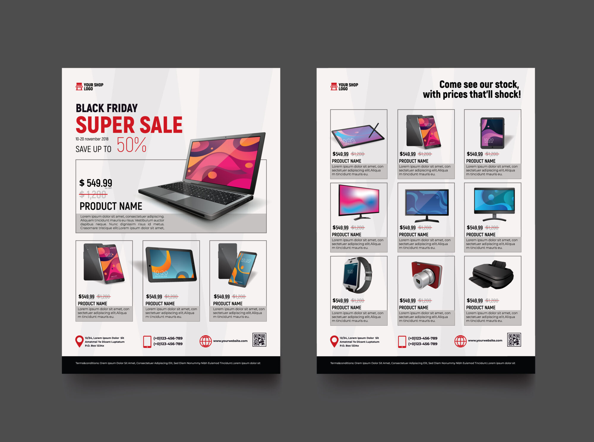 They also created separate cards for the same shoes in different colors. However, unlike Aarhus, Coclico has a small assortment. For these reasons, the availability of separate cards for the same products, which differ only in color, did not cause difficulties for buyers.
On the product page, it should always be possible to select and explore all the parameters of the same product. No need to force customers to look for other colors in the catalog.
Sorry, other shoe colors were not shown on the Coclico product page. Although small previews of other colors were displayed in the Related Products section (“We thought you might like these too”), users expected to see other color options on the product page. Displaying this product in a different color as a companion increases the risk that users will simply ignore it. In addition, the lack of other shoe colors will make people leave the product page in search of other options.
It would have been better if the Coclico product page could have chosen different colors of the same model, as is done on Article.com, which sells beds in different sizes and colors.
Article.com: On the product page, users could select different colors and view product images in the color they wanted before purchasing.If the product catalog is small, then it is possible to show variations of the same product that differ, for example, in color, on different cards in the catalog. However, on sites with a medium to large assortment, searching for the same product presented on multiple cards will increase the complexity of the task for the user.
It might seem like a good idea to break the variations of the same product into separate cards to give the impression of a wide choice. However, in real situations, this practice creates the following problems for users:

17.02.2022
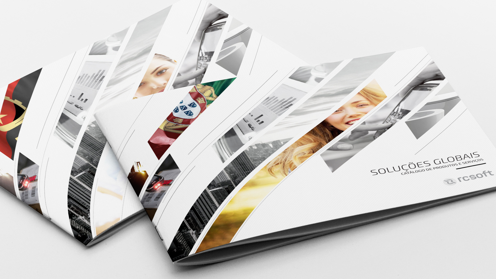
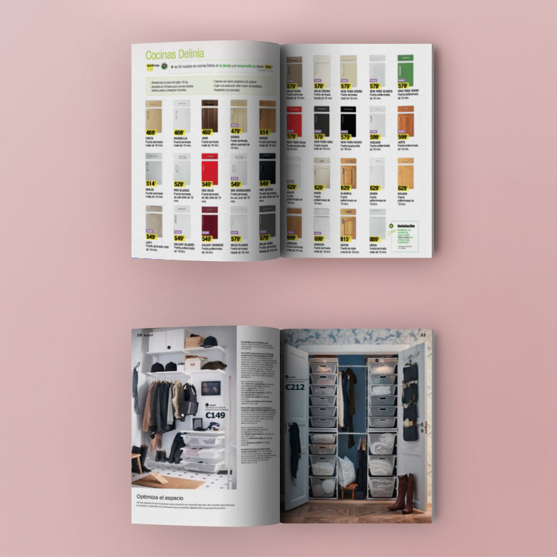
Making printed catalogs is a lot of nuances to keep in mind. How to arrange, how to place goods, what products to place and where exactly? Is it worth resorting to the development of individual design? Everything matters: any "little thing" can stimulate buyers to purchase a product - or vice versa. Luckily, there are a few tips that will make your printed product more interesting and appealing to customers.
Before you start designing, you need to understand what printing is for. Catalogs are used in different areas and areas, for example:
Each type is arranged in its own way, but in any case, printing should be attractive, well-structured and of sufficient quality.
How do you design print that works? There is no universal solution - you always need to consider the project as a whole, with a brand, marketing tasks, and a product. However, there are a few tips that will be relevant almost always.
 The quality of photographs, individual design, and the presence of accompanying texts depend on this. At this stage, it is important to decide on the budget and write the TOR for all specialists.